The Washington Post, by Philip Kennicott
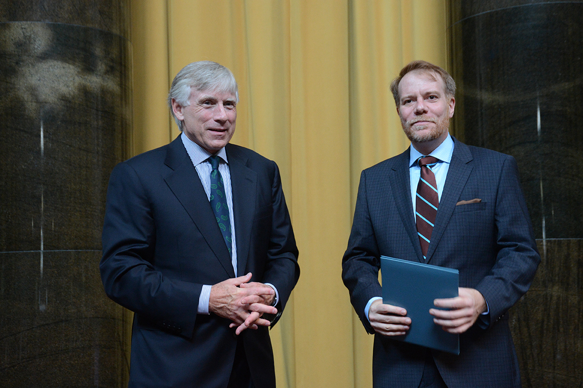
Lee C. Bollinger, President of Columbia University (left), presents the 2013 Criticism prize to Philip Kennicott of The Washington Post.
Winning Work
Taryn Simon’s terrifying, relentlessly organized images show how we learn to look past humanity when some higher power tells us it’s necessary
By Philip Kennicott
Taryn Simon’s art doesn’t look like it was made by an individual. Her photographic displays are so orderly and spare that one might think they were assembled by a committee, perhaps human rights activists documenting some horrendous government crime, or lawyers laying out their case for a class-action suit. Row after row of relentlessly similar portraits have the limited expressive power of a high school yearbook, or a Most Wanted poster on a post office wall. Every portrait is carefully numbered, and every number refers to a minimalist caption on a text panel nearby. The aesthetic is cold, methodical and meticulous.
The tone of Simon’s monumental photographic project, “A Living Man Declared Dead and Other Chapters I-XVIII,” now on view at the Corcoran Gallery of Art, is so at odds with its subject matter that one at first suspects a joke, a conceptual smirk hidden somewhere in its reams of material. For four years, Simon traveled the world documenting the impact of genocide in the former Yugoslavia, the effects of thalidomide on a family in Scotland, polygamy, faith healing and AIDS in Kenya, and 15 other “chapters” that are almost equally serious and sobering. Every one of her chapters has the basic ingredients of a National Geographic cover story: a view through the lens of anthropology, environmental science or sociology into some essential conflict between ancient and modern values, some lingering historical trauma, some collision of religion and modernity.
But Simon’s work lies on the antipodal dark side of the planet from National Geographic. Her portraits show people decontextualized, not in their homes or going about their business, but sitting on a stool, against a generic background, and often wearing almost expressionless faces. People reduced to data points.
Simon assembles her own idiosyncratic archives, clinical troves of evidence rather than emotional, activist or inspirational narratives. As she lines up galleries of orphans in Ukraine and albinos in Tanzania (whose skin color leaves them under constant threat of violence from human “poachers”), the dispassionate documentary tone becomes confusing. What is at the heart of this project? Is it about human misery? Or about the way photographs are used to document that misery? Or is there something perversely “artistic” underneath the whole thing, a game, a bit of performance art, an artistic imitation and critique of the documentary impulse, as if Simon is a one-woman representative of the juridical wing of the Dada movement?
Even the catalogue of the exhibition, an enormous black volume, seems to wink at the very misery it contains. Its 773 pages are contained in a heavy, official-looking cover that looks as if it should be a collected library edition of an obscure medical or scientific journal. Simon’s explanation of the project focuses on the contrast between the portraits, which are all in some way about bloodlines or lineal descents, and the chaos of life that leads people into the maw of fortune, into war, or exploitation, or crime, or in one case a deadly blood feud between two Brazilian families. But this explanation is almost as confounding as the project itself, as dry and unhelpful as the captions that form a central part of her display.
Terrifying, brilliant work
So consider the rabbits. Chapter VI turns away from human conflicts and takes up the subject of rabbits, but with the same thorough, seemingly institutional approach. In 1859, her text panels says, “twenty-four European rabbits were introduced to Australia.” Those rabbits had no natural predators, and they have multiplied to such an extent that their depredations have become an environmental disaster for the native ecosystem.
Using the same photographic approach, the same simple bench and pale, ivory background, Simon has photographed dozens of Australian rabbits, carefully organized to show their descent in three basic bloodlines. But the rabbits are part of an experiment: Scientists are searching for diseases with which to inject them, and thus reduce or eliminate the non-native rabbit population. Nearby, just as she does with her human chapters, Simon has a box of texts and captions that give a minimal explanation of the rabbits and the disease that has been introduced to kill them, including the observation that all the rabbits in her portraits either died of the disease or were euthanized. Another panel shows an image of dead rabbits, and a rather absurd chocolate “bilby,” an Australian marsupial that has been promoted as an alternative to the Easter Bunny.
Simon acknowledges that this chapter is one of the rare — perhaps the only — instance of humor in her series. But it is Swiftian humor, dark and cutting, and it brings the whole project into focus.
Consider a basic set of reactions to the rabbits, which are photographed under glass and carefully numbered like her human subjects: The rabbits are adorable, but environmentalists tell us they are destroying the ecosystem; therefore, they must die. We must harden our hearts against their cuteness. If we trust science, we must resist their appeal to our more tender sympathies.
It is that appeal to harden the heart that makes Simon’s work so terrifying and brilliant. In a stroke, the viewer is in exactly the same place as a mid-level bureaucrat authorizing the use of trucks for ethnic cleansing, or a military leader signing off on a little collateral damage as the bombs begin to fall. Simon’s rabbits make the banality of evil palpable, the way in which we learn to look past the humanity in an image when some higher power — political, religious, scientific — tells us it’s necessary.
Confronting a dark history
One of the most disturbing things about Simon’s archives is their obvious affinity with some of the most ugly photographic projects of the 20th century. Her images remind one of the photographic documentation of human physiognomy made in the service of the pseudo-science of eugenics, or Francis Galton’s efforts to use composite photographs to reveal basic criminal types, or the meticulous photographic records of genocide victims kept at Tuol Sleng, the notorious Khmer Rouge prison in Cambodia. The photographic archive has a dark history, which Simon’s work confronts daringly but elliptically.
No surprise, then, that one important chapter in her series directly addresses the Nazi past, although in a typically oblique and unemotional way. The descendants of Hans Frank, “Hitler’s personal legal adviser and governor-general of occupied Poland,” are catalogued in Chapter XI, though many of them declined to participate for obvious reasons. Standing in for the missing relatives are blank photographs, and in some cases, photographs of clothing, a personal substitute for the absent subjects. One assumes that those who were willing to participate did so because they’ve made their peace with the long shadow cast over the family by Frank’s crimes, that the connection “by blood” to a perpetrator of great crimes is irrelevant to their personal values and sense of responsibility or guilt.
The Nazi chapter demonstrates how the closeness of “blood” relation still haunts us, how the sins of the father are still visited down the generations. Simon’s charts, organized by what seems at first a fussy or arcane obsession with family or blood connections, remind us of the astonishing and outsize role these connections continue to play in moral life. Everything is tribal.
A different perspective
When religion fails us (a recurring theme of several harrowing chapters), when science can give no moral certainty, we tend to focus on preserving and helping those closest to us. A simple example might well be how many millions of Americans think about global warming, which threatens the whole family of man: Even as we acknowledge the threat, we fall back on the necessity of getting our kids to school, preserving our immediate lifestyle, taking care of those closest to us.
Simon’s chapters, although seemingly dry and archival, emerge as remarkably profound meditations on how we sort through the world, what ethical and moral impulses we honor and which ones we squelch. Her work insists on a more fundamentally rational relationship to photographs, and especially to photographs of people. It stands in stark contrast to projects such as Edward Steichen’s 1955 Family of Man exhibition, which used photographs from around the world to create an essentially sentimental view of the supposedly universal bonds between people of vastly different cultures. Her portraits call into question the fundamental appeal of the human face, the sense that looking into the eyes of someone in a photograph somehow establishes a real and emotional connection. Although it seems, at first, that anyone who can’t respond to the humanity of the faces staring out of these photographs is morally stunted. But the crux of many chapters, and ultimately of the entire exhibition, is that the appeal of the face is blunt, primitive, and inadequate to sorting through the larger moral and political questions raised in the exhibition.
So the organizational fetish, the institutional tone, emerges not just as an approach or style, but as the subject of the entire project. Simon’s work asks us to think, for a moment, like an institution, without appeal to emotion, to see problems rather than people, to sharpen the moral sensibility on the hard edge of pure utilitarianism. It doesn’t endorse this kind of thinking, but it invites us to indulge it, so we can see it in operation, understand its appeal and its power. It’s a cliche to praise art for its ambiguity, its lack of hard answers. But the hollow, dizzy feeling you may have after “A Living Man Declared Dead and Other Chapters” is the real and vital shock of being left without answers of any sort, confused and numb about the way forward for a species that manufactures so much of its own misery.
Roche’s designs had technocrats in mind
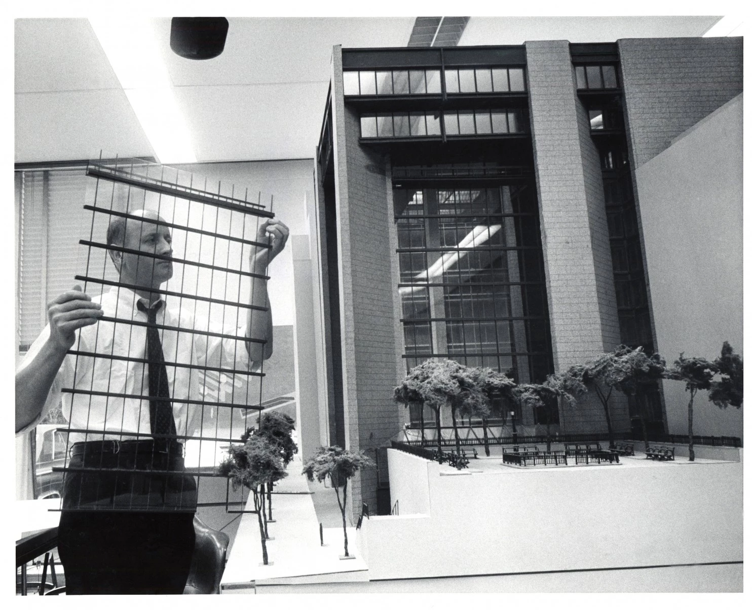
Kevin Roche inserting the curtain wall into a scale model of the Ford Foundation Headquarters, c. 1964. (Courtesy Kevin Roche John Dinkeloo and Associates)
In the mid-1980s, I was condemned to spend several years in New Haven, Conn., at the time one of the saddest and ugliest cities in the world. Preeminent among the many ugly things in New Haven were two buildings designed by Kevin Roche: a factorylike stadium, which placed parking above the arena, and a fortresslike office tower with massive turrets at each corner, which was so bluntly arrogant in its blank, alien form that it made all the city seem its prisoner.
An exhibition of Roche’s work at the National Building Museum doesn’t make these buildings seem better, but it does absolve Roche of the worst things you might think about him if you knew only his New Haven abominations. With partner John Dinkeloo, Roche’s firm became the successor to Eero Saarinen’s office after Saarinen died in 1961 at age 51. They saw through to completion several of Saarinen’s most revered projects, including the Gateway Arch in St. Louis and Dulles International Airport.
But when Roche began working under his own name in 1966, his output didn’t have the sculptural exuberance or high-minded utopian imagination of Saarinen. Responding to the robust economy and the emergence of giant American corporations, with their seemingly bottomless appetite for new office space, Roche responded with technocratic fervor, rewarding his clients with giant, geometrical enactments of their organizational structure. He made architecture look like a flow chart.
It’s hard to be objective about an architect when you have long hated even one of his buildings. It’s also hard being objective about the architecture of the 1960s and ’70s, which seems like a very bleak period, the heyday of brutalism and too many vitiated efforts to purify or dress up the dying modernist box. There has been a push recently to reassess the architects of this period, including meticulous renovations that have forced reappraisal of some buildings once thought irredeemably hideous. And, of course, taste changes, so perhaps the ’60s and ’70s will seem as fashionable in a few years as midcentury modern is now.
But Roche and Dinkeloo (as KRJDA) built some real stinkers, and they were often working on such a scale that when a building failed, it failed big, bad and awful. To be fair to this exhibit and to Roche (who is still active in his 90s), it’s worth putting in one column all the good things about his oeuvre.
The building museum exhibit, a smaller version of a show organized by the Yale School of Architecture, stresses the architect’s environmental sensibility, arguing that he was ahead of his time in thinking about building systems and how buildings relate to the world around them. One of Roche’s best buildings, the 1963-68 Ford Foundation Building in New York, arrayed offices around a huge internal garden, one of the early examples of the giant terrariums that have become standard in hotel lobbies and corporate space.
Clients loved him, and in many cases, remained faithful to his firm over decades. Among Roche’s institutional patrons is New York’s Metropolitan Museum of Art, a landlocked, land-hungry beast that he has been helping expand and modernize since 1967, most recently with a newly designed American Wing, which opened this year.
Even his corporate spaces, which responded to the needs of the company and the basic human needs of its employees, were often innovative. A 1970-75 corporate headquarters for the pharmaceutical company Richardson-Vicks in Connecticut was nestled into a wooded environment with as much care as possible to keep the landscape intact. Parking was placed above and below the building, which was built not by clearcutting the landscape, but from one end to the other, to minimize impact on the forest. With their windows and offices arrayed to maximize light and views, and with their forests and moats and artificial lakes, Roche’s corporate buildings are often a delight to work in.
Even the ghastly things he built in New Haven have a certain logic. The Knights of Columbus Building, which looks like a giant stack of identical stereo components, was designed to place stairways and toilets in its four corner turret towers, keeping the main office floors open from unnecessary obstructions. The arena, which has been torn down, solved a basic parking issue with a brute but rational solution. A high water table meant that parking couldn’t be placed underground, so with one quick slice through the Gordian knot, Roche placed it above, accessible by spiral ramps.
It’s also possible that hostility to Roche’s work stems from a more fundamental and problematic hostility to his corporate clients. Roche helped define the “corporate” look: the sleek shiny glass walls, the capacious campuses with carefully manicured glimpses of nature. In the 1960s and even into the ’70s, it appeared that corporations were our friends, a ready and reliable route to prosperity, with promises of pensions, health care and careerlong loyalty. But they were amoral entities, and the fact that they have mostly absolved themselves of any sense of local responsibility, any loyalty to their employees and any moral niceties beyond the duty to maximize profit shouldn’t be held against an architect such as Roche. As the classic argument goes: If he hadn’t been building them good buildings, somebody else would have built them bad ones.
At the heart of Roche’s career and this exhibit is a fundamental question: What does it mean to serve power? The best of Roche’s work expressed an intelligent response to technical, architectural problems. It was tinkering on a grand scale to make the wheels of power turn more efficiently, with less of a toll on the people inside and out. More disturbing are the works that simplflattered power — the triple pyramids of the 1967-71 College Life Insurance Co. in Indianapolis that reflect the hierarchy of the corporate ladder or the inhuman, Versailleslike symmetries and vistas of the 1983-88 Bouygues World Headquarters in France. If power corrupts, and absolute power corrupts absolutely, what can be made, morally, of buildings that tell their inhabitants you run the world?
The final verdict on Roche’s work, and the work of architects like him, is decades away. His firm is still working and building in Washington (the quite good Station Place 1 near Union Station and the dreary, shiny glass box of Lafayette Tower are by KRJDA). He has won just about every major prize that can be bestowed on an architect, including the Pritzker in 1982 and the American Institute of Architects Gold Medal in 1993. The horrendous buildings he created in New Haven (and some proposed structures such as the mercifully unrealized 1969 plan for the Federal Reserve Bank of New York) expressed an aesthetic that developed into something lighter, more refined and anodyne.
In the end, Roche’s reputation will rise or fall depending on what becomes of the corporate world he served. If the end of corporate America is a dystopian hell of environmental catastrophe, vast economic inequity and social instability, the corporate architects of our age will not be remembered fondly. But if our age yields to a better one, just as the tyrannies and kleptocracies of past centuries sometimes yielded (perhaps temporarily) to more enlightened, democratic societies, then Roche’s work might have the charm of baroque palaces, Egyptian pyramids and Parisian avenues. Amnesia and nostalgia are powerful forces, as anyone who has watched “Mad Men” knows.
By Philip Kennicott
Our fascination with ugly images of suffering and humiliation is an old one. But where is the web taking us?
The picture arrived on the front page of the New York Post, ignited a firestorm of controversy and then faded within the usual two to three news cycles. It showed a dark-haired man in a light-green jacket, standing on the New York City subway tracks as a Q train approached. “Pushed on the subway track, this man is about to die,” read the headline, making it dreadfully clear that this was an image of death in action.
Like Robert Capa’s 1936 photograph that purportedly shows a Spanish Republic militiaman struck by a bullet and collapsing on a hillside. Or Eddie Adams’s agonizing 1968 image of a Viet Cong soldier executed on the streets of Saigon. Or grainy screen grabs of Saddam Hussein on the gallows. Debates about the image twisted and turned the usual poles: Is it ethical to take and exhibit this kind of image? And why is it so compelling?
The anxiety about whether it is seemly to feast one’s eyes on the moment of another man’s death is at least as old as Saint Augustine, who recounted in the “Confessions” the futile resistance his protégé Alypius made to the attractions of gladiator contests. When Alypius was dragged, resisting and protesting, to the arena by a gaggle of worldly friends, the young man closed his eyes so as to not see the bloodshed. But the roar of the crowd broke his will, and when he opened his eyes just momentarily — like the shutter of a camera going off — he was transfixed: “He was no longer the man who had come to the arena, but simply one of the crowd which he had joined, a fit companion for the friends who had brought him,” wrote Augustine.
The fear that we may be attracted to and corrupted by images of suffering is nothing new. And photographs of imminent death are only one extreme example of a larger body of images that fall into the guilty-pleasure category of images of distress. Define pain to include emotional distress, humiliation and even mild embarrassment, and one realizes that we spend an extraordinary amount of our lives taking pleasure in photographs of the hurt of others. Add in images that demonize our enemies, or make us feel smug, or appeal in some other way to the worse angels of our nature, and one has an enormously large, but often overlooked category of dark pleasure.
An enduring, visceral fascination
Call it the Ugly Image. Like it or not, these kinds of images give people a particular kind of pleasure, a glimpse at the disordered, frightening, repellent side of life, and often the disordered, frightening and repellent side of ourselves. The history of art is full of them and still today, in the hush of museum, it’s terrifying to feel the visceral tug of blood in a crucifixion painting, or hear the raucous, mocking laughter of soldiers casting lots for Christ’s clothes, or survey the tangle of naked corpses on a life raft lost in the billows of the sea. A 16th-century painting in London’s National Gallery, attributed to the Flemish painter Quentin Metsys, shows a woman elegantly attired, with a jeweled ornament in her headdress, rings on her fingers and ample breasts squeezed into a low cut dress. But her face is misshapen and beastly, her nose like a snout, and from her cheekbones to her shoulders, wrinkles gather like a sagging rubber mask.
Is it horrifying, or funny? Pitiful, or a 16th-century version of peopleofwalmart. com, where contemporary image seekers can look at obese shoppers, people with ridiculous tattoos, skirts so short they’re indecent, and other cheap atrocities of fashion and grooming? With the fading of longstanding religious and traditional beliefs, which sanctioned gruesome images of the Crucifixion, martyrdom of saints, sadism in Hell, and all kinds of monsters and freakish prodigies of nature, one senses in contemporary moral culture an effort to find new opportunities and new forms of permission to sate the appetite for this kind of image.
Facebook and Twitter have become vast, voyeuristic bazaars of freakishness and pain, inviting us to laugh at politicians having bad hair days, or a peasant carrying too many goats on the back of his motorbike. There’s a dead Syrian rebel, killed by the thugs of Bashar al-Assad. There’s the same dead Syrian, loyal to Assad, killed by rebel thugs. The captions shift, but the invitation to a fast, easy, cheap emotion is the same. A toothless man says racist things about President Obama. A pious liberal prig spouts off inanities about Romney. Rarely these images tell us something useful about the world. Mostly, they indulge the same appetites that were once sated by racist jokes in the back of the bar, or gladiator contests and circus spectacles.
Online, a torrent of ugliness
The year 2012 was rich in images of ugliness, not just photographs and video of people suffering and dying, but images that allowed us to enjoy the discomfiture of our enemies, to feel better about ourselves by enjoying the dridiculousness of other people, to confirm easy and unconsidered prejudices about the world and our brothers and sisters upon it. The subway death image was particularly powerful but not particularly rare. In the last year alone, powerful photographs of Tibetan protesters immolating themselves and running aflame through the streets, and images of a Peruvian policeman being dragged, face down and bleeding, by a crowd in Lima have made the ubiquitous best-of-the-year galleries. These last two, perhaps, provide useful information to the world, teaching us about political passions and conflicts far from our own world.
But what to make of the rest of the bumper crop of petty schadenfreude, humiliation and embarrassment from 2012? The last year was a campaign season, so caricature images and photographs of losing candidates looking physically exhausted and spiritually defeated abounded as well. War and nationalism were in the usual abundance, too, so many of the most compelling photographs of 2012 played off of tribal feelings, from images of rage in the Middle East to “aren’t they strange?” photographs that mock cultural differences.
It would be easy to compile a perverse “Best of the Year in Ugly” list, just by culling the viral and memorable photographs that circulated in the news media. Strong contenders: Lance Armstrong lying alone on a sofa, beneath his seven Tour de France yellow jerseys, no longer the velo-hero of yore (Category: Humiliation, although the image was tweeted by Armstrong himself); a gay activist being brutally stomped by hooligans in Ukraine (Category: Physical Harm and Cruelty); Mitt Romney pumping gas after losing the presidential election, looking slightly less than his usual groomed and upbeat self (Category: Schadenfreude, for 50.6 percent of the population); a man in India being mauled by a leopard (Category: Physical Harm and Cruelty, runner-up); Chinese women sunbathing on a beach with their faces covered in full head masks (Category: The Strangeness of Others).
But there were too many to make a meaningful list. And these kinds of lists, like Web sites that post celebrity mug shots and newspaper articles that anguish over whether to print disturbing images, are generally a way of keeping the images in circulation, allowing their pleasure to be distributed yet more widely.
The nature of that pleasure remains elusive and troubling. Look at the ancient and wrinkled woman surrounded by jewels and finery, staring into a mirror as a servant delicately places a feather in hair.
In Bernardo Strozzi’s “Vanitas,” circa 1637, an ancient and wrinkled woman stares into a mirror. She is surrounded by jewels and finery, and a servant woman is delicately placing a feather in her mistress’s thin gray hair. The painting carries a clear, simple and deeply misogynistic moral message about the ridiculous of vanity. Look at the anti-Semitic caricatures in hundreds or thousands of Renaissance paintings of the Passion of Christ, and you will find a clearly expressed worldview that reinforces Christianity’s foundational blood libel. The squalor of William Hogarth’s “The Rake’s Progress” is as easily understood as an Aesop fable.
But the Ugly Image today is generally at odds with how we think about our moral view of the world. Would the people who clicked through the Web gallery “Celebrities who Look Older Than Their Age” indulge in this kind of cattiness in their real lives? How many parents who pass on links to the New York Post’s “Fifty Fat Celebrities” gallery would suggest to their children that laughing at people because they are overweight is acceptable behavior? How many people who retweeted that photograph of Mitt Romney pumping gas would advise their children that after you win a game you should mock the loser?
Sharing the schadenfreude
The Internet has proven the perfect vector for the ugly image, enabling our funnycruel-horror receptors with the same dexterity it showed for pornography. It neither invented the kinds of images that give us guilty pleasure nor the dissonance between that pleasure and our real moral selves. But it has made that private pleasure palpably public, and the sheer quantity of traffic in these images has made our hypocrisy almost quantifiable. And the quantity is huge.
There are so many of these images circulating in so many places — plug in the hashtag “#fail” and there’s a snapshot of Levi Johnston’s “memoirs” marked 30 percent off at Dollar Tree — one is tempted to say that we have become a culture that thinks in this kind of image. The speed and instantaneousness of photography captures and makes tangible the unprocessed thought, the thing for which you once would have sought private absolution in the confessional booth, or indulged with a smile then suppressed with a grimace while pondering the grand guignol of life before falling asleep. Even the idea that we “share” these images on social media brings with it a tinge of hypocrisy. Sharing a piece of pie means having less of it for yourself. Sharing a video of a meth addict hurling obscenities at the police isn’t exactly an act of giving; it requires nothing of the giver and passes on nothing of value, either.
A famous Hellenistic statue, the original of which was probably carved in the second or third centuries B.C., shows an old woman sitting on the ground, disheveled, with a strap of her dress falling down perilously close to her right breast. Her eyes goggle, and she looks up at the viewer with a stupid, perhaps inebriated grin. The “Drunken Old Woman” remains a puzzle: Is she a devotee of the wine god, participating in some ancient ritual, or a grotesque moralizing figure meant to remind us of the brevity of beautyand the passing of life? Or simply a figure of fun? The moral role this statue played in its own time is mostly lost to us.
As obscure to us, we might say, as the moral role of the ugly image in our own age. Perhaps these images are simply a pressure valve, small ways to vent ugly impulses in cyberspace rather than indulge them in life. Perhaps hypocrisy freely indulged on the Web is necessary to the definition of our real values in civic life, the dark tones in one sphere defining the light in another. Perhaps the preternatural communion with billions of people afforded by the Internet makes it all the more necessary that we affirm our own existence and value by laughing at others, forcing us all into a vast, cyber version of junior high school in which bullying and cruelty are a primal defense mechanism against being lost in the crowd.
It’s the speed and ubiquity of these images that make one despair. The difference between a snapshot of a drunken old woman posted on the Web and a statue of a drunken old woman in a museum is the amount of time one spends with each. The Hellenistic statue at least has a chance to engage our empathy. The Ugly Image today is inexhaustible, fleeting and transient. It would be reckless to make claims about where this is all going, foolish to suggest that beauty is dead, or ugliness triumphant. But something is happening, some kind of cleft in the moral life that is being widened, channeled out by torrents of small images that invite us to enjoy suffering or think ill of others. If all of this is widening the canyon between our better and worse selves, on which side of this chasm will we end up standing?
By Philip Kennicott
The best museum exhibits mix delight, education and provocation so subtly that the visitor isn’t aware where one bleeds into another. The National Building Museum’s new long-term display, “House & Home,” explores a subject so wide and so fundamental to American life that it inevitably touches the pleasure buttons of nostalgia.
There are places where one wishes the stress were different, especially the environmental costs of building a society premised on homeownership and low-density population dispersion. But the curators have managed to tell a complicated story clearly and engagingly. And they haven’t neglected complex questions about how race, gender and government policy have affected the physical structures we live in and the sentimental structures that nourish us.
The exhibition has been in the works since 1995. During that long gestation came the great economic crisis of 2008, spurred, in part, by risky mortgage lending, which had a tremendous impact on the housing sector. The curators have taken note of the events, with a timeline that marks a 32 percent jump in foreclosures between April 2008 and April 2009, and the devastation of boomtown developments across the country. A photograph of the Foreclosure Express, a bus that shuttled prospective bargain-hunters around the decimated suburbs of Las Vegas, is a painful late chapter in this more than 200-year odyssey.
The timeline gives the most thorough account of other dark chapters in the real estate industry, from government-sanctioned mortgage policies that made it virtually impossible for many African Americans to obtain mortgages to laws in the early 20th century that prevented Asian immigrants from owning land. And, of course, there was the grand theft of a continent from Native Americans. The lingering effect of two centuries of persistent and systematic racism isn’t just seen in segregated neighborhoods. Last year, the Pew Research Center released a report analyzing government data, which made clear one result of this historical pattern: The median wealth of white households is 20 times greater than that of black households.
Unless you read the timeline thoroughly, however, much of this history will stand apart from the experience of the exhibition, like an unpleasant footnote sequestered in the back of the book.
Using photographs, films and a gallery of small- and large-scale models, the bulk of the exhibition focuses on more feel-good fare. The basic contrast between house and home, between physical shelter and emotional nest, is introduced in the first gallery, where rows of photographs display a wide range of house types and the panoply of life that transpires in the home. Two large dollhouses are included, reminding visitors how early the sense that we must have a traditional home, filled with material goods, is inculcated in us. The more curious of the toy houses was made in the 1970s and features parquet floors, globe lampshades, modular storage and abstract art.
Interspersed with the photographs are quotations that give a good sense of the ambiguities and even ambivalence in how we relate to home and house. Homeownership is equated with prosperity and stability. “No man who owns his own house and lot can be a communist,” said William Levitt, the famous real estate developer who gave us Levittown, Pa., a lingering fantasy and nightmare of generic prosperity. But a house is also a burden and can make us isolated monads in a world that needs collective responsibility. Ralph Waldo Emerson made part of that explicit when he wrote: “A man builds a fine house; and now he has a master, and a task for life . . .”
The feel-good spirit of the exhibition doesn’t dwell on the deeper ambivalence of family life. Curiously, the curators include a quote from author Charlotte Perkins Gilman: “The home is the center and circumference, the start and the finish, of most of our lives.” But in light of her most famous work, “The Yellow Wallpaper,” about the imprisoning nature of the home and family life for so many women, that quote feels very different than it does decontextualized on the wall of this exhibition.
The heart of the exhibition, and the source of its pleasure, is a long gallery of finely made house models, full-size mock-ups of basic construction methods and rows of classic household objects. The construction techniques include the stolid minimalism of adobe brick, the rough-hewn carpentry of post and girt (a Colonial practice), and the increasingly light and flexible forms of balloon frame (introduced in the 1830s) and platform frame (the type most often used in new neighborhood developments).
Unfortunately, especially given the basic architecture of Washington, there is nothing that demonstrates local brick construction. More disturbing, nothing is said about the dirty little secret of so much construction over the past half-century: It is shoddy and reaching obsolescence. The exhibition won’t tell you that there is increasing concern that the average life span of the typical new American home could be from 30 to 50 years.
The disposable nature of American society is suggested (although, perhaps, not intentionally) in a long wall of objects typically found in homes over the past 200 years. Including plastic kiddie pools and a Farrah Fawcett poster, the display functions as a jolt to the memory and a test of historical knowledge. It will probably be the high point of the exhibition for families, and with a tortilla press and Islamic prayer rug chockablock with a 1950s cocktail set and 1806 Broadwood piano, it is admirably multicultural in its assemblage. But it’s hard to look at many of the objects that became household necessities in the past half-century — video games, answering machines, Barcaloungers — and not think of our burgeoning landfills.
The exhibition takes note of consumerism in one of a series of short films about basic themes of home and family life. And just when the photographs and images from old magazines and newspapers seem relentlessly and claustrophobically devoted to the standard-issue nuclear family, another series of films shows us Rodney White and Tom Brown, two men living in a beautiful prefabricated house in New York. It is one of six understated but evocative shorts that follow people through a typical day as they inhabit different kinds of living spaces, including an itsy-bitsy Tumbleweed Tiny House that has one room and barely 100 square feet of space.
The film featuring the male couple isn’t idle, token inclusiveness. One of the essential conclusions of this exhibition is how the home we make in our houses is a projection of our American-ness. For immigrant families, it is a place apart and a demonstration of common humanity. Creating a home humanizes us in two essential ways: It makes our life richer and more human, and it makes us seem more human to those around us. Basic metaphors of cultural inclusiveness — “a place at the table” — are derived domesticity. Not surprisingly, the controversy over same-sex marriage is often an argument about the sanctity of the home from two very different perspectives.
By the end of “House & Home,” you may feel some of the basic envy that motivates people who are addicted to home-and-garden shows and snooping around Sunday afternoon open houses. For so many Americans, the home isn’t something inherited, a cultural invariable handed down in some basic form for centuries upon centuries. The home is made, and if you can make it one way, you can make it another. Even if you are happy in your home, there is always someone who might be happier. The home is essential not just in grounding us but in making us restless. For all of its omissions, “House & Home” does a good job of demonstrating how our living space is the first and most fundamental theater for our relentless self-invention.
By Philip Kennicott
At the Corcoran, they call it “the three c’s”: a museum agenda focused on the collection, the college and the community. But what is easily summarized with a neat, alliterative mnemonic does not, in practice, always yield a coherent identity.
Looking back over a decade or more of exhibitions at the Corcoran Gallery of Art gives one a dizzying sense of how widely the institution defines its mission. Shows of student work and work by faculty at the Corcoran’s art school jostle with populist fare such as a 2002 exhibition about Jacqueline Kennedy and photography shows devoted to Richard Avedon and Annie Liebowitz. In between were some memorable and important exhibitions that explored substantial themes and bodies of work, including the 2010 Eadweard Muybridge photography show and the huge and rewarding 2007 exhibition “Modernism: Designing a New World,” with which , then the Corcoran’s director, hoped to reboot the institution after the 2005 disappointment of canceling a major addition project by Frank Gehry.
Add it up, the hits and misses, the controversial exhibitions that seemed designed to court and flatter collectors rather than woo audiences, the flat-out embarrassments — such as the 2003 show devoted to J. Seward Johnson Jr.’s sculpture (excoriated by former Post art critic Blake Gopnik as the worst museum exhibition he had ever seen) — and you get a sense not just of an institution serving many masters, but an institution responding honestly but erratically to the myriad and often fractious currents in the art world today.
And then there was Mapplethorpe.
The cancellation of a 1989 show of Robert Mapplethorpe’s homoerotic photography still haunts the museum, as much as they would like to put it in the past, as much as they have tried to repair the damage and not blunder into similar controversies. As the art world once again discusses the fate of the museum — the board of directors is currently considering selling the 1897 museum building and decamping for a new location — it is the Mapplethorpe exhibition that is almost invariably chosen as the beginning of the institution’s long trail of woe.
“It fractured the board of trustees in a significant way,” said Philip Brookman, chief curator and head of research at the Corcoran Gallery of Art. Brookman wasn’t at the Corcoran when the Mapplethorpe controversy exploded during the height of the debate about public funding of art and the role of the National Endowment for the Arts. He was at the Washington Project for the Arts, which stepped in and hosted the exhibition after political pressure from homophobic Sen. Jesse Helms and other culture warriors affrighted the Corcoran’s leadership.
“More important,” said Brookman, “it damaged the Corcoran’s reputation in the museum world. I think that still exists.” Still, Brookman doesn’t want to dwell there.
“I wish we could get past it.”
When case studies are written about how to blow up a nonprofit institution, the Mapplethorpe controversy is key among them, a classic map that prefigured controversies such as the implosion earlier this year at the breast cancer charity Susan G. Komen for the Cure (which suddenly appeared political after trying to deny funding to Planned Parenthood), the 2010 censorship of an exhibition of gay and lesbian portraiture at the Smithsonian’s National Portrait Gallery, and the current power struggle at the University of Virginia. In all four cases, institutional leadership seemed unaware of the basic human capital invested in the organization, unaware that the people who keep the institution alive view it in essentially familial terms, not bureaucratic or organizational ones.
And so a decision made from the top wasn’t just unpopular, but perceived as peremptory, dictatorial and disenfranchising, and the result was a cascading sense of betrayal and alienation. In all four cases, the base of the organization reacted not with a dispassionate weighing of self-interest, but with the kind of family feud intensity that keeps grievances fresh for decades.
That, in some ways, may be the basic institutional problem of the Corcoran: It serves a collection of Corcoran families (local artists, students, art lovers looking for something more experimental than what is offered at more institutional museums), which is a source of strength, and often an impediment to focusing its mission. It has, like all institutions, made mistakes along the way, but for some reason it hasn’t been able to capitalize on the things it does right. Every wrong turn advanced it further toward isolation, dark progress that for some reason wasn’t remedied by many right turns. People stopped listening; donors turned away; audiences drifted elsewhere. And now, no matter what it does, it doesn’t get the credit it deserves when it does something right.
A case in point is the current exhibition devoted to the paintings of Richard Diebenkorn. It’s a very fine show, it looks spectacular in the Corcoran’s galleries and it demonstrates how vital the Corcoran can be if it remains focused on something missing from “the three c’s”: the city’s serious audience for art. Yet at a critical moment, when the Corcoran desperately needs people to rally behind it, the board of directors has indicated that it is seriously considering a move that would further alienate supporters of the museum. Board Chairman Harry Hopper, in an interview with Washington Post reporters, said he and the board “weren’t out pounding the pavement on behalf of the institution” until they have “a plan that makes sense.”
So even if a wildly successful Diebenkorn show prompted a flood of support for the institution, it’s not clear that it could be marshaled to preserve and build the Corcoran, another instance of the goodwill engendered by successful programming being squandered by leadership without vision. The Corcoran’s idealistic agenda focused on the community, the college and the collection is now in danger of being whittled down to just the college, leaving the collection without a landmark home, and the community again wondering what its relationship to the institution should and will be.
By Philip Kennicott
The recent past, somewhere 25 or 30 years ago, is becoming History. A jumble of chaotic and competing impressions is being thinned out, given order and apparent causality, until it feels more distant than recent memory, more intriguing and coherent. The ordinary and invisible details of life, hemlines, hats and hairstyles, become palpably odd as the near past undergoes the process whereby it becomes, as one British novelist has written, “a foreign country.”
The forging of history has been advancing through the darkest years of the AIDS crisis, through the 1980s when the disease was new, dimly understood and widely terrifying, into the 1990s in which the plague spread and decimated a generation of gay men before the introduction of powerful new drugs in 1995. A revival of a classic play about the early days of the AIDS crisis, new documentaries that tell the history of AIDS activism, a continuing engagement by artists and curators with cultural responses to AIDS and, of course, anniversaries — including last year’s 30th anniversary of the emergence of the disease — have kept the visceral story of AIDS before the public, even as it has become a chronic or manageable disease.
Yet something is changing. Larry Kramer’s “The Normal Heart,” which ran at Arena Stage in July, unfolds like a history play, full of strange references to arcane things like the telephone book. The footage seen in the powerful documentary “How to Survive a Plague,” about the activist group ACT UP, feels decidedly archival and historical — is that a breadbox or a cellphone? — to eyes used to the clarity of hand-held digital cameras. There is metamorphosis in the texture of memory, the smells, soundtrack and taste of it, as the age of AIDS looks as remote as the sun-drenched, leached-out colors of old Vietnam War films.
It’s not just that the 1980s and ’90s are slipping ever further into the past. If cultures remember the past in any way analogous to how individual people do, we seem to be at the moment when it’s safe to pull out the old photo albums, thumb through images of lost love and departed friends and submit to the full weight of emotional reminiscence. We live in a culture in which we argue over what happened five seconds ago. But the AIDS years are rapidly becoming settled history, with nostalgia creeping into how an older generation remembers them and the shock of surprise as a younger generation learns them for the first time.
David France, the director of “How to Survive a Plague,” has seen the phenomenon firsthand at advance screenings of his film, which opens Sept. 21. An older generation that lived through the worst of the AIDS crisis has broken with a self-imposed moratorium on thinking about death and disease, and a younger generation is experiencing the film as an introduction to a chapter of history that, for different reasons, many people have conspired to forget.
“What is becoming plain is that people who didn’t experience the plague years have an idea that something really awful happened, but it got better — that the system took care of it,” says France. “What they don’t know is the real revolutionary work that got done, in part by AIDS activists.”
France sees his film as a step toward taking up a narrative thread that was broken sometime in the 1990s.
“In the past, cultural representations of AIDS have all been about the tragedy of it, about how dark and hideous it was, that this unknown disease came and targeted a community,” says France. “All of that was true, but we stopped our storytelling right in the middle of it, and we haven’t until now gone back to resume that storytelling.”
The broken thread in the narrative, his film argues, is the role the gay community played in directing and shaping the medical research that eventually led to the drugs that now prolong life, apparently indefinitely, for most of those lucky enough to have access to them. Groups such as ACT UP, the militant-yet-disciplined activist organization that put the story on the nightly news and forced it onto the political agenda, also shaped the history of medical research. Susan Ellenberg, a statistician who was working for the National Institutes of Health at the time (and who appears in France’s film), agrees with that assessment. Today, thanks to the work ACT UP did a generation ago pioneering participatory medicine, patients and families of patients are intimately involved in shaping the research agendas of scientists working on breast cancer and a host of other diseases, says Ellenberg.
“United in Anger,” another recently released AIDS documentary, takes France’s argument even further, suggesting that ACT UP helped drive arguments still in play today about universal health care, poverty and racism. Both films present the once-feared and widely derided activist group, which fell into bitter infighting and fast irrelevance in the mid-1990s, as an innovative, even revolutionary force in American politics. And they recast the history of AIDS to include something of which the people involved, and younger generations of activists, can be proud.
They also question cherished pieties of mainstream politics, reminding a new generation about the devastating indifference and neglect of the Reagan and first Bush administration in dealing with the disease. Old archival footage shames open bigots such as Sen. Jesse Helms, who is seen fulminating against Sodomites on the Senate floor. And figures now seen as grandfatherly avatars of an innocent yesteryear, such as George H.W. Bush, are heard piously and impatiently condemning a generation of men who were inconveniently dying on their watch. Both films also address the highly controversial ACT UP protest at New York’s St. Patrick’s Cathedral, called to challenge the Catholic Church’s influential condemnation of condoms, the only hope of survival for sexually active people during the crisis. The hostility directed at the group after disrupting a religious service is now seen in a broader more sympathetic historical perspective.
“I think ACT UP changed the world,” says Kramer, author of “The Normal Heart.” Kramer was founder of ACT UP, and now a legendary and legendarily irascible eminence grise in the gay movement. “The Normal Heart,” which had an off-Broadway run in 1985, offers a pre-history to the period covered in the two recent AIDS documentaries. Set in 1981-84, it is one of the bleakest documents of the early days of AIDS, an unrelenting howl of fear and anger that was almost unbearably raw when it first premiered. Broadway producer Daryl Roth organized a staged reading of it October 2010, and the response was powerful enough that she brought the play to Broadway, where it won three Tony Awards.
“Much to everyone’s surprise, it was as if it was happening today,” says Kramer, of the initial response to the 2010 reading. “It really freaked everyone out. Everyone thought about it as some kind of period piece.”
The initial audiences for the Broadway production, according to Kramer, were mainly older gay men. But the producers instituted a “30 under 30” policy, which gave $30 admission to people under the age of 30. The policy worked.
“The play started selling out with all these kids,” says Kramer. “They were just completely bowled over.”
Roth saw a double process in the intergenerational audiences that flocked to the show. The quarter century that had elapsed since the play was first produced allowed older audiences to experience it not just as a piece of political protest, but as art. And it allowed younger audiences to connect to older viewers.
“Being able to see the play from a distance had two benefits,” says Roth. “It was easier to view it as a piece of powerful theater because it wasn’t as devastating and raw as it was then, and it was a time for people of that generation to revisit and remember, painful as it is.”
Roth also noticed that many audience members came in groups. “Older people were bringing younger people.” Mothers came with their sons. “It was something that people wanted to share and talk about.”
That suggests that yet another, broad change is happening to the memory of AIDS. Collective memory is often tribal, jealousy guarded, closed to outsiders. The trauma of AIDS — or war, or genocide — binds those who experienced it so tightly that there is no energy left for other affinities. “You weren’t there,” and “You don’t understand” are the defensive reactions of people unwilling to see memory pass into collective possession, with the inevitable distortions, simplifications and cliches that come with giving up one’s personal past to History.
An exhibition produced by Transformer and Visual AIDS (a New York-based group devoted to addressing AIDS and preserving art made in response to it) hints at the complexities of the current, intergenerational moment in the memory of AIDS. Held at Fathom Gallery and curated by John Chaich, “Remixed Messages” juxtaposes works by canonical artists closely associated with AIDS, such as David Wojnarowicz and Felix Gonzalez-Torres, with work by younger artists who are not explicitly engaged with AIDS as a subject. Chaich says he is borrowing a term — “AIDS is a crisis of connections” — when he describes the organizing motif of the show. But it’s an apt description of most of the art in the exhibition, which feels under the influence of AIDS in a less urgent but deeper and broader way. Whether or not the artists had AIDS in mind, they seem to be grappling with a set of AIDS-inflected moral truths: That intimacy is full of both grace and danger; that great traumas punctuate life irrevocably and make time less elusive; that the suffering which defines us cannot, should not, must not be cast off, even if that were possible. A sense of irony and provocation also defines much of the work, often palpably echoing the graphic design and dark humor of AIDS arts collectives that once plastered the streets of New York with posters.
Amy Sadao, the outgoing director of Visual AIDS, uses the term “creating lineages” to describe the cultural response of younger artists, especially gay or the more broadly defined “queer” artists. Younger artists are taking up the subject as their own, exploring the broader reach of the disease.
“Queer-identified artists, curators, performers, cultural workers, are attempting to find and define a queer history,” she says. They don’t necessarily feel themselves on the outside of a tribally held AIDS history curated by the older generation of mostly gay white men who are the heroes of David France’s film. But there’s also a sense of generosity, even gratitude to that generation.
“What I’m struck by is this younger generation’s identification of that broken lineage, that missing history,” says Sadao.
A historic moment, in hindsight
In 1996, journalist Andrew Sullivan published what was then a controversial and now classic essay, “When Plagues End,” which explored the ambiguities of what changed with the introduction of anti-retroviral drugs and the so-called “Lazarus effect,” which brought many HIV-infected people back from the brink of death. He used Albert Camus’ novel “The Plague” to describe the richly unresolved emotional transition that many people went through. “We expect a catharsis, but we find merely a transition,” wrote Sullivan. “We long for euphoria, but we discover only relief tinged with, in some cases, regret and depression.” One of the great historical and defining moments in gay history passed without any real acknowledgment, in part because people were still uncertain, still scared, still shocked, and in part because the society was still pervasively homophobic and unwilling to acknowledge the role gay people played in their own redemption.
The plague wasn’t over, as Sullivan acknowledged, and as was abundantly clear during the 19th Annual AIDS conference held in Washington last month. But something had changed, and only today is that something being finally processed. The threat of extinction passed on, yet only now is the emotional weight of that moment being acknowledged.
Gay history has always been complicated, by the very definition of homosexuality, which didn’t enter the lexicon until the late 19th century, and by the enormous and ongoing changes in how people define gender, sex and sexuality. Gay history has had trouble getting started, from the abortive and shame-filled spectacle of Oscar Wilde to the decimation of AIDS that followed so fast upon the official beginning of modern gay culture in the rebellious 1960s. What seems to be happening now, as the horizon of time casts its shadow over the years of AIDS, is that gay men can see themselves properly in the historical mirror for the first time, and they like what they see. Suffering and all.
By Philip Kennicott
Annie Leibovitz photographs the 1 percent, the rich, beautiful and famous, conspiring with the apparatus of celebrity and capitalism to make the lives of successful people feel even more glamorous and alluring. The Library of Congress has officially declared her a “Living Legend,” and despite a few financial problems awhile back — a massive home-renovation project in Greenwich Village contributed to the setback — she has joined the same rarefied ranks of privilege that she has so diligently served throughout her career.
Her photographs are beautiful and scrupulous, and she has won just about every award a photographer can win, but there is something tragic about her oeuvre. Her pictures represent a bankrupt and vacuous world not as it really is, but as an ideal that both animates and mocks the 99 percent, the losers in our winner-take-all system.
So it is a bit of a surprise to see this subaltern handmaiden of the fame industry create a new body of work, on display at the Smithsonian American Art Museum, that is almost entirely free of portraits. “Annie Leibovitz: Pilgrimage,” which opened Jan. 20, is billed as an intimate look at a personal journey she made during a period of emotional and spiritual crisis. Punctuated by the occasional image of the American sublime — the enormous torrent of Niagara Falls captured from above, the iconic plume of a geyser at Yellowstone National Park — Leibovitz’s pilgrimage is a photo record of her visits to the homes, gardens and stamping grounds of some of her favorite dead people.
She had planned a project called the “Beauty Book,” a collaboration with her longtime friend and companion Susan Sontag, the critic and polymath who died of cancer in 2004.
“After Susan died, I knew that I couldn’t do the Beauty Book,” writes Leibovitz in an essay that accompanies the exhibition. “As time passed, I realized that I might do a different book, with a different list of places. The list would, inevitably, be colored by my memory of Susan and what she was interested in, but it would be my list.”
That list took form slowly, and as it did, Leibovitz performed the stations of her pilgrimage with camera equipment in tow. The results are eclectic but mostly reflect the heroic pantheon of the bookish liberal establishment: Charles Darwin, Henry David Thoreau, Virginia Woolf, Georgia O’Keeffe, Eleanor Roosevelt. Among the 64 photographs culled for the Smithsonian exhibition are images of Freud’s sofa; a rattlesnake skeleton displayed in the Abiquiu, N.M., home of O’Keeffe; a television set disfigured by a bullet hole, once owned by Elvis Presley; and the woven-cane bed that Thoreau slept on while at Walden Pond.
There isn’t much internal logic to this cabinet of curiosities, although in several cases photo curator Andy Grundberg has created dreamlike juxtapositions. Putting Freud’s couch and the darkroom of Ansel Adams in proximity suggests the unconscious of the photographic process, the hidden manipulations that lead to the polished surface of the printed image. The primal power of water at Niagara Falls, Yellowstone’s Old Faithful and the Spiral Jetty (an earthwork sculpture by Robert Smithson that is often submerged by the Great Salt Lake in Utah) suggests, respectively: deep emotional undercurrents, irruptive psychic forces and the play of surface and depth that governs so much of how we think about ourselves and the world.
The photographs make everything feel more real, closer, more textured and sensuous than anything found in real life. They have the inherent sexiness of glossy magazine imagery, and as you look at the interiors photographed at the home of Ralph Waldo Emerson or Val-Kill, the cottage where Roosevelt lived and worked, the idea of a visit begins to seem futile. Why bother? The interiors could never look this good, this intimate, this inviting. In many cases, the view offered by Leibovitz’s lens is far superior to anything a tourist might have access to. The light is better, the detail clearer and you don’t have to bend over a display case.
Although she is photographing things, not people, it is not clear that this project, seemingly an homage to her heroes, is all that different from Leibovitz’s celebrity photographs. As Sontag wrote in her classic book “On Photography”: “One of the perennial successes of photography has been its strategy of turning living beings into things, things into living beings.” That’s a perfect summation of how “Pilgrimage” relates to Leibovitz’s earlier work: Celebrity photographs objectify people, while “Pilgrimage” conjures the aura of celebrity from the objects once owned by historic figures.
Even the introductory essay by Doris Kearns Goodwin, the Pulitzer Prize-winning historian, embraces the phoniness. Goodwin’s essay begins: “As a historian, nothing matters more to me than the chance to wander through the rooms where my subjects lived and worked.”
But “as a historian,” she ought to say that what really matters is archival material, ideas and facts, not PBS-style emotive rambles through the boudoirs and kitchens of dead presidents. And original research, given that Goodwin was accused of plagiarizing substantial amounts of text from multiple authors for her 2002 book “The Fitzgeralds and the Kennedys.”
But Goodwin has rehabilitated her career, in part, by practicing history as a form of public emotional spectacle, as if parodying in narrative form the famous suggestion by photojournalist Henri-Cartier Bresson that photographers search out “the decisive moment.”
This matters because there is a strange mix of insipid sentimentality and self-promotional personalization of history in this project. This supposedly private, restorative pilgrimage is a very public and narcissistic form of old-fashioned hero worship. Notice, for instance, how many times Leibovitz refers to her heroes on a first-name basis: Emily for Emily Dickinson, Virginia for Virginia Woolf, Eleanor for Eleanor Roosevelt. Or how often she photographs beds, and bedrooms, as if her pantheon is also a personal B&B, where the great and famous always leave the light on just for her.
Millions of Americans make some version of the kind of pilgrimage captured in Leibovitz’s images. Catering to this tourism has been an industry for a century or more, and there is a widespread belief that these visits help establish an emotional relationship between 21st-century Americans and their history. But warm feelings of personal connection to a historical figure don’t necessarily carry with them any particular understanding or knowledge of what that figure did. Not enough suspicion is directed at the inherently mythologizing tendency in this national pastime.
Certainly, none emerges from Leibovitz’s “Pilgrimage.” This is about celebrating the goodness of people, the beauty of things and stoking an insatiable desire to have and hold the sacred relics of history. Again, Sontag is the best critic: “Despite the illusion of giving understanding, what seeing through photographs really invites is an acquisitive relation to the world.”
This is no history lesson. This is an essay in consumption, the same restless appetite to feel close to famous people stoked by glossy images in glossy magazines.
By Philip Kennicott
“Manifest: Armed,” at the Corcoran Gallery of Art, was in the works long before a dead-eyed young man with orange hair was charged with killing 12 and injuring 58 in a movie theater in Colorado, and before a white supremacist killed six, wounded three, and leveraged racial and religious fears in a Wisconsin Sikh temple. And since it opened on Aug. 8 there have been yet two more high-profile shootings, with three dead in Texas on Monday and a security guard wounded outside of a right-wing think tank in Washington on Wednesday.
In a culture besotted with guns, any exhibition about firearms is likely to become horribly, accidentally, surreally topical. And so “Manifest: Armed,” dominated visually by a display of meticulously crafted paper guns, hanging from the ceiling and arrayed on the floor like a spectral arsenal, arrives at yet another moment when much of the country is outraged: about the ubiquity of guns, or the ritual but impotent calls for gun control.
Yet the Corcoran’s director of college exhibitions, Joseph Hale, who helped organize the cogent and provocative one-room show, insists that it is not about guns. Rather, guns are a prism for looking at ideas about how information circulates; how facts are disseminated, stored and gathered on the Internet to create new things in the real world; and how communities are formed through our complex and interconnected world. Guns turn out to be a good way of exploring these issues, because they are icons and instruments of power. Gun fetishes and pornography circulate on the Web because they are fueled by pure, libidinal energies in the flesh-and-blood world.
The three projects on display have a curiously utopian element, a second or third thought they spark about humanity that makes one feel almost sentimental about the prospects for our species. That’s remarkable, given how dark and depressing is the main idea they each embody. Artist Sarah Frost, the creator of the ghostly paper guns, has gathered online instructional videos from YouTube in which boys teach viewers how to make elaborate and detailed models from white paper and tape. The community of boys is far-flung, passionate and dedicated to craftsmanship.
“These kids are crazy committed,” Hale says.
The models range from precise reproductions of popular guns in circulation to fantasy weapons found in video games such as Halo and Mass Effect. The boys’ obsession with instruments of death and destruction, at least as old as the Iron Age, is mildly depressing — rather like it’s depressing to watch motorists rubberneck when passing an accident or shoppers trample each other to secure the best merchandise on Black Friday. It’s humanity, it’s flawed, and it’s a bit humiliating that we belong to this club.
But much of what these boys are doing resembles art, including the need to communicate with each other, the rendering of ideal objects based on things in the world and the craftsmanship with which they make the models. Frost’s paper guns — which look fragile and are mute in way that suggests both death and dispassionate detachment — are a poignant attempt to honor the things that resemble art in the strange, sweet but eerie world of online gun modeling. Titled simply “Arsenal,” Frost’s work is provocative, nonjudgmental and curiously moving.
Julian Oliver’s “Transparency Grenade” uses a small computer, wireless antenna and microphone — inside a translucent, grenade-shaped case — to capture (theoretically) anything that is floating around on wireless signals (and ambient noise) wherever it is “detonated.” The data are then to be uploaded to a server where they “can be mined for information,” according to a Corcoran description of the object. The implications for privacy are obvious, and for legal reasons, the “grenade” has only “detonated” once, in Berlin, and then only provisionally so as not to gather information that could be legally problematic, according to Hale.
By packaging what is essentially a small cluster of computer pieces into something that looks like a hand grenade, Oliver is flirting with the incendiary playfulness that makes art either exciting and edgy or, all too often, cheap adolescent provocation. But the cleverness of Oliver’s piece and the questions it asks tip decisively in favor of the grenade having real substance. Again, it is the work’s tension between the better and worse angels of our collective nature that raises it above a knowing jape.
The “transparency” in “Transparency Grenade” is both an unwanted peeping into private communication and a powerful tool for accountability, and in many ways it raises issues similar to the debates about WikiLeaks, a grand online document dump that exposes the inner workings of powerful organizations while making it potentially impossible for those communities to function effectively, for good or ill. A grenade is not a surgical tool; it is a blunt, powerful and indiscriminately effective weapon, best thrown only in desperation. And yet, like the atom bomb, there is something curiously ennobling about not using it.
But what if such things fell into the hands of bad people? The answer to that is addressed in fascinating, elliptical ways by the most conceptually complicated project on display, “FireSale©TM,” by Colin Beatty and Craig Smith, who operate as the collective SmithBeatty. The project involves purchasing a gun, disassembling it and mailing its pieces to “33 stakeholders, including museum directors, art curators, artists, university professors, lawyers and a weapons manufacturer president.” The pieces are defined as shares in a corporation and beautifully packaged into sturdy cases. Recipients aren’t asked whether they want to participate, and when the collective issues a call on the shares — the gun pieces — the participants can ignore the whole thing or return the gun parts as asked, which are then reassembled.
The inevitable “missing” pieces are manufactured using a 3-D printer, a powerful technology that may at some point allow almost anything to be reproduced at home using digital design files readily found on the Internet. In the case of “FireSale©TM” — which includes extensive and beautifully rendered documentation of the project, a blog on which participants record their reactions, and the gun pieces (or their 3-D printer substitutes) — the missing gun elements, made from a fragile white plastic compound, are not functional.
But with apparently credible reports that 3-D hobbyists have managed to use more sophisticated iterations of the technology to create the essential operating element of an M16 — heralded by some observers as “the end of gun control” — the dark side of SmithBeatty’s work is obvious. If you have the right specifications, at some point you could “print” yourself enough firepower to topple governments. Perhaps.
The positive, practical elements of this technology are obvious: Surgical tools could be available in remote locations; easily acquired replacement parts might put an end to landfills stuffed with barely broken toasters. But there’s a deeper utopian element in how SmithBeatty conceived its game. By structuring the project as a corporation, the duo demonstrates how the complexity of human interaction may be the greatest brake on our collective suicide. The busy executive who tosses out his piece of this gun effectively stops the reassembly. Only complete participation — almost impossible to get in any project — can yield a functioning gun. At least for now, but perhaps not for long if 3-D technology is sufficiently advanced.
If nothing else, “FireSale©TM” makes us aware of how we are invested, wittingly or not, willingly or not, in our collective destiny. Technology drives us forward in a magnificent spectacle of human accomplishment, yet it propels us toward ever-more apocalyptic possibilities. The artist’s role — one role, at least — is to warn us about these dark possibilities, before Rubicons are breached that can never be uncrossed. If you don’t like a world filled with guns bought at gun shows, over the Internet or at mom-and-pop corner shops, imagine a world — what is being called the “Thingiverse” — in which almost anything can be replicated by anyone, anywhere. We will have democratized our world all the way back to Thomas Hobbes’s jungle of violence and despair.
And so technology, progress and enlightenment make and undo us. Rousseau has been warning us about the dangers since his 1750 “Discourse on the Sciences and Arts.” Then, as now, it’s tempting to retreat into a shell, to focus on the self and feeling and the near-at-hand world, and hope the rest of this vast system takes care of itself. It won’t, of course, which is why we need exhibitions such as “Manifest: Armed.”
By Philip Kennicott
Who is embracing whom in that photograph of the Obamas that went viral on election night? The photograph, shot from below and isolating the first couple against a cloudy sky, shows the president embracing his wife at a campaign rally in August. The first lady is seen from behind, enclosed in the arms of the president, whose eyes are closed. Sent from the president’s Twitter account Tuesday night shortly after news networks declared him the winner, the photograph was immediately retweeted hundreds of thousands of times, making it the most popular image in Twitter history and propelling it to instant love across a host of social-networking programs.
It has all the generic ingredients of a successful political image. With its moody and slate-gray sky, it encapsulated the drama many of President Obama’s supporters felt Tuesday evening: The Obamas had weathered the storm. It also appealed to the almost cultlike sense of affection many Americans feel for the couple. Surging through social networks commonly used to keep people in touch with family and friends, it offered a sense of intimacy with the first family, stroking the same emotional receptors as photographs of the Obama daughters, Malia and Sasha, and the family’s dog, Bo. For Democrats, it also has a basic allegorical function: The bonds of love between Barack and Michelle Obama symbolize a healthy society. For African Americans, it adds to a repository of images that celebrate the success of the Obamas in opposition to the frequent demonization of supposedly dysfunctional black families in popular culture.
But the photograph has a remarkable and specific latent message, too. Unlike many images of political marriage in which the man lays claim to his wife through a symbolically possessive gesture — touching her shoulder, raising her hand up or kissing — the embrace between these two people seems mutual. The first lady is, among many other things, a big woman, famed for her well-toned arms, and in this image of hugging, she’s giving as good as she gets.
The president, if anything, seems to need this hug and appears almost dependent and vulnerable. The obligatory masculine markers of leadership — resolve, self-sufficiency and emotional equanimity — dissolve into the obliterating communion of two people lost in their own love world.
It’s impossible to know the reality behind this image, whether the president and the first lady are indeed in love in the way that photograph suggests. Perhaps this is just another very successful variation on the carefully staged depiction of love that is mandatory for political success. But regardless of the reality, that variation is significant. The photograph strongly suggests an ideal of mutuality in marriage, unencumbered by older ideas of possession and obedience that still hold sway in some deeply traditionalist religions.
Political rhetoric keeps those older ideas alive in vestigial but important ways. It’s a common joke, among politicians, to say that one’s spouse is “the best choice I ever made.” George W. Bush loved this line, and Mitt Romney reprised a version of it in his concession speech early Wednesday. It seems at first a mildly self-deprecating statement, flattering the man’s “better half.” But it also reinforces marriage as a man’s choice of a woman, and the politician as a decision maker. It is marriage cast in the active tense, with the man as subject of the sentence.
Videotape of the Dubuque, Iowa, campaign event in August at which the photograph was taken show plenty of small scenes of traditional political love: The president leaning in for a kiss, touching Michelle’s shoulder, walking hand in hand. But out of what must surely be thousands of images of the two together, the president chose this photograph to tweet, disseminating an image that emphasizes neither the man’s power nor the woman’s beauty. The image that went viral, that clearly speaks to people, represents a more modern ideal of true equality in emotional relations.
That it went viral on the same night that voters in four states broke with decades of anti-gay-marriage voting patterns and endorsed equality for same-sex couples may not be entirely accidental. Opponents of same-sex marriage often speak of the necessity of “defining” marriage in traditional terms, and anxiety about gay marriage is frequently expressed as a broader fear of redefining long-standing gender norms and categories. Conservative authors have produced books that decry the feminization of the American male, describing men as an endangered species.
The Obama photograph shows another reality, what might be called the limitless possibilities of true mutuality, of marriage beyond strict definitions. The Obama marriage appeals to many people, because it seems so comfortable, as if no one is worried about who wears the pants in the house, which is the reality of many healthy marriages today. In a healthy marriage, the partners don’t simply step into ancient gender roles and enact a drama of fidelity and obedience, they invent their own roles in the manner that serves both people best. Marriage is improvisatory, and every marriage is unique. Variation flourishes, and people work it out.
Among the many things that will come with a broader societal acceptance of same-sex marriage — which won at the ballot box for the first time since it emerged as a wedge issue in the 2004 reelection of President George W. Bush — is an extraordinary boon for straight men. The strictures of masculinity will likely fade as the fear of homosexuality abates, leaving more room for individual men to define their own notions of masculinity. That this photo became so popular at this particular moment suggests that we may be parsing the broader cultural implications of this election for a long time to come.
By Philip Kennicott
One of the saddest and shortest of Anton Chekhov’s short stories, “Misery,” is about a horse-sledge driver in St. Petersburg who tries, with no luck, to engage his passengers in conversation. One by one they enter his cab, and one by one they fail to see his humanity, his suffering, his desperate need to talk. And so, at the end of the day, he unhitches his horse, puts her to stable and begins to talk to the only ears that listen.
“That’s how it is, old girl,” he says, telling his horse about the death of his son. “Now suppose you had a little colt, and you were own mother to that little colt. . . and all at once that same little colt went and died. . . . You’d be sorry, wouldn’t you?”
Charlotte Dumas’s photographs of the horses that draw the funeral caissons at Arlington National Cemetery have some of the same intense emotionality as Chekhov’s story. On display at the Corcoran Gallery through Oct. 28, “Charlotte Dumas: Anima” is the Dutch artist’s first solo exhibition in the United States, and perhaps because the subject is so local and so fraught with emotion, her images push at the boundaries of sentimentality. The large white horses are seen against inky backgrounds, captured at the end of a day pulling coffins, and the photographer depicts them almost at the point of lapsing into sleep.There is something tremendously sad at the core of our relationship with the animals that serve us or keep us company. They are mute, we cannot thank them, and we can never really know whether there is any kind of reciprocity of the love we feel for them.
One image, “Peter,” shows the beast with his nose just touching the ground, his front legs tucked under his body. He looks as if he is praying. “Amos” captures the head of another animal from the side, with one eye facing the viewer, filled with what seems to be sadness. In “Repose,” the horse is on the ground, its head facing the viewer, its entire body a study in exhaustion.
Dumas has done everything possible to photograph the horses in the liminal state between wakefulness and sleep, so the suggestion of fatigue may have nothing to do with work or overwork. Rather, it’s a strategy for heightening their vulnerability, a dreamlike suggestion of death as they pass out of consciousness and into a defenseless but restorative oblivion. Without the wall text to explain the photographs, one might well think these horses are dying, rather than relaxing after human burial rites.
It is almost too much, almost cheap, like the little lambs that used to be carved atop the headstones of dead children. Grief is so potent, so universally felt, that artists risk exploitation anytime they tread this ground. But Dumas’s photographs challenge the viewer to think about our anthropomorphizing of animals and the conventions of portraiture. Rationally, we know that these animals’ lives revolve around hay, oats, water, sleep and the repetitive (and to them utterly meaningless) task of pulling heavy objects. If they are aware of the human grief all around them, it is in a very minimal, impressionistic way, rather like dogs may sense you’ve had a bad day.
Yet the beauty with which they have been photographed, the way in which they seem to emerge from darkness into light and the canny decision to capture them as they fall asleep all contrive to make us believe they are feeling what we would feel if we had to do the work they do. Just as human portraiture often is carefully constructed to be an analogy for religious suffering, Dumas’s horse portraits invite you to believe that these animals are suffering for us. Fortunately, they also invite you to work past that conceit, to put the horses back into the category of animal.
In several cases, Dumas gives us only part of the animal, as in “Rise,” in which we see the back and neck, or “Middle,” in which we view part of the torso. The latter image isn’t obviously of a horse: It could almost be a carcass. By juxtaposing these photographs with ones that invite a more childlike connection — simple adoration of the horse as human proxy — Dumas emphasizes the complex middle ground that animals occupy, more than brute but less than human. And that allows her images to float free of the purely human, grief-laden associations of their work at the cemetery.
The Arlington series was specially commissioned by the Corcoran and involved repeat visits by the photographer to Washington. It is part of a larger overview of Dumas’s work that also includes a 2005 series devoted to wolves (“Reverie”), a 2006 series about racehorses (“Palermo 7”) and a 2008 series depicting stray dogs. The photographs invite and resist an immediate emotional response before resolving into something more abstract: studies in how small details of portraiture affect the impact. In her images of racehorses, one is struck by how “dehumanizing” it is to wear things on the face. The less gear the horses have on or around their heads, the more they seem to emerge with dignity and individuality, echoing the way uniforms (especially service uniforms) often diminish the dignity of people wearing them.
The stray-dog series, shot in Palermo, Italy, pushes many of the same buttons as the horses in “Anima.” The special bond of dogs to humans, by now far more familiar to most people than the special bond we once felt to our horses, is easy to exploit. Dumas seems self-conscious about that danger in many of these images, which often present their subjects as if detached, indifferent to their surroundings, even haughty. In “Nivero, Palermo, Sicily,” a black dog is draped over the stone steps of an old building, alert but lazy, holding his turf with something like condescension. Not all of the dogs look so well-fed and robust. The sadder images in this series will pierce even the most self-disciplined dog lover.
That seems to be the point of this work, forcing us to be more rational in our relationship with animals. Often, the love of animals can seem like an inferior version of what is styled “real love”: If you can’t find a spouse, you can always have a cat. The emotional tie is a substitute, and a pathetic one.
But Dumas’s work — and Chekhov’s story — change the status of these relationships. The sadness that runs so deep in our relationship to beasts isn’t about the inferior status of that connection; rather, it’s a reflection of the disappointment we often feel in our relationships with humans. Our love for an animal will always be existentially less significant than our love for a person. But our love for animals may be more perfect.
December 31, 2012
To the Judges,
For Washington Post critic Phil Kennicott, there’s little distinction between art and social criticism. Whatever the aesthetics of the art, his readers come away thinking about the sweeping forces that underlie it. He not only interprets art for his readers, he makes it relevant, urgent and deep.
He confronts genocide, abuse and war in a review of a Taryn Simon photographic project, witnessing the art through the lens of a “mid-level bureaucrat authorizing the use of trucks for ethnic cleansing, or a military leader signing off on a little collateral damage as the bombs begin to fall.” What her art does, he writes, is show how often we “look past the humanity in an image when some higher power — political, religious, scientific — tells us it’s necessary.”
He confronts the nature of corporate America in an exhibit on architect Kevin Roche. “If the end of corporate America is a dystopian hell of environmental catastrophe, vast economic inequity and social instability, the corporate architects of our age will not be remembered fondly. But if our age yields to a better one, just as the tyrannies and kleptocracies of past centuries sometimes yielded (perhaps temporarily) to more enlightened, democratic societies, then Roche’s work might have the charm of baroque palaces, Egyptian pyramids and Parisian avenues.”
He confronts the strange and dark allure of violence and misfortune in a powerful, post-Newtown essay, “Why do we stare?” He examines how our age-old, perverse delight in others’ woes is amplified by social media. He forces us to consider the unthinking act of forwarding, say, an image of Saddam Hussein on the gallows: “Is it ethical to take and exhibit this kind of image?” Kennicott asks.
In essay after essay, review after review, with a voice that ranges from dryly arch to deeply sympathetic, Kennicott holds us all to account. He sets the highest standards not only for art criticism but for our society. The Washington Post is proud to nominate Philip Kennicott for The Pulitzer Prize in Criticism.
Sincerely,
Marcus W. Brauchli
Executive Editor
Biography

Philip Kennicott is chief art critic of The Washington Post, which he joined in August 1999. He has also been chief classical music critic for the Detroit News and the St. Louis Post-Dispatch, where he also worked for two years as an editorial writer. Before that he was a New York-based editor at Musical America and Chamber Music magazines.
In 2000, Kennicott was a Pulitzer Prize finalist for editorials opposing a concealed-carry gun initiative in Missouri (which failed despite heavy support from gun-rights organizations). In 2006, he was an Emmy Award nominee for a Web-based video journal about democracy and oil money in Azerbaijan. He has also won a Cine Golden Eagle for his video work. In 2010, he won the American Association of Sunday and Feature Editors’ general commentary award. Kennicott now writes extensively about architecture and the intersection of architecture and culture.
Kennicott graduated summa cum laude with a degree in philosophy from Yale in 1988. Before attending Yale, he spent two years at Deep Springs College in California. Kennicott, who blogs at philipkennicott.com, is a monthly columnist for Gramophone and a frequent contributor to Opera News and other musical publications.